

Adding a border to an HTML element is not a hard task, CSS provides us the border property which allows us to style the border of our elements. However, when those elements have been clipped using clip-path the story is a little bit different. To this day there is not support to perform this task, my solution: overlaying items.
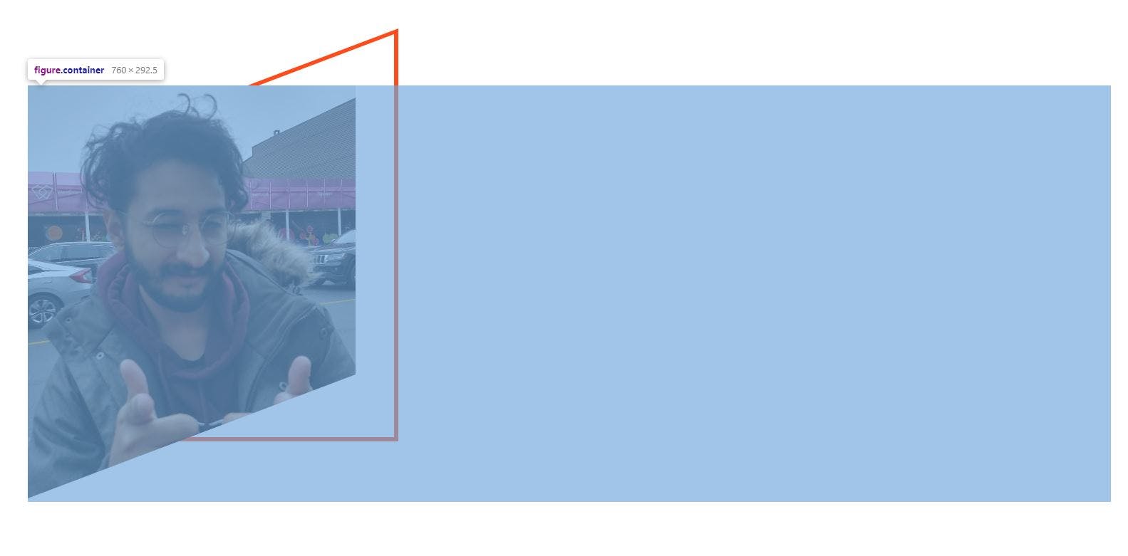
To make things more interesting, I will show you how to add a border to a clipped element to decorate an image as in the picture below.

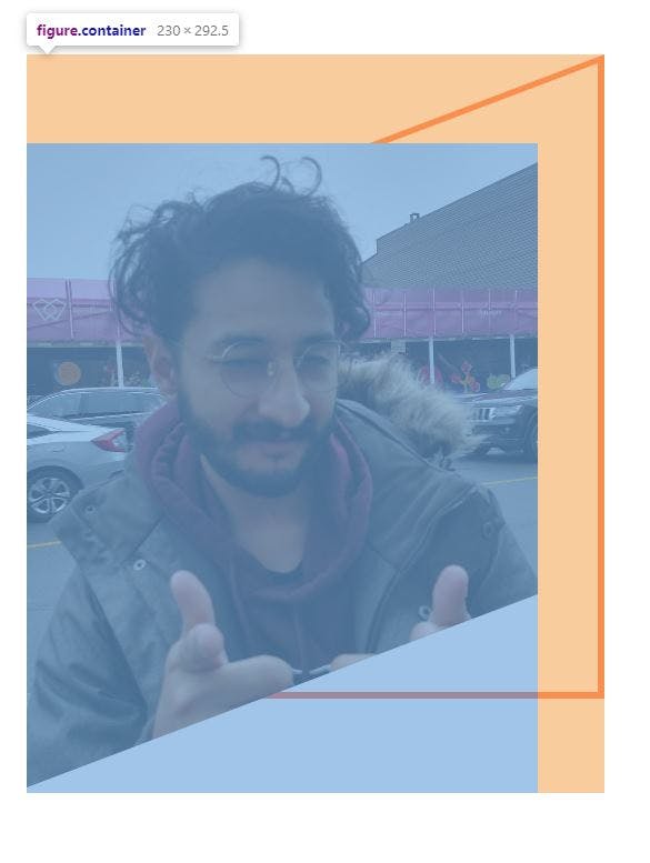
The image in question has been clipped and a mirrored item has been added to decorate it, the markup to achieve this effect is the following.
<div class="test-card">
        <figure class="container">
            <img src="Carlitos.jpeg" alt="Carlitos smiling" class="test-card__img">
        </figure>
</div>
The figure contains the image as well as the decoration, now let's add some basic style to our CSS as follows:
*,
*::after,
*::before {
    margin: 0;
    padding: 0;
    box-sizing: border-box;
}

html{
    font-size: 62.5%;
}

.test-card {
    display: flex;
    justify-content: center;
    padding-top: 5rem;
}
font-size: 62.5% allows us to assign the value of 10px to 1rem making the implementation of relative measures easier.
Let's now clip the image:
.test-card__img {
    height: 29rem; /*290px*/
    width: 23rem; /*230px*/
    object-fit: cover;
    clip-path: polygon(0 0, 100% 0, 100% 70%, 0 100%);
}
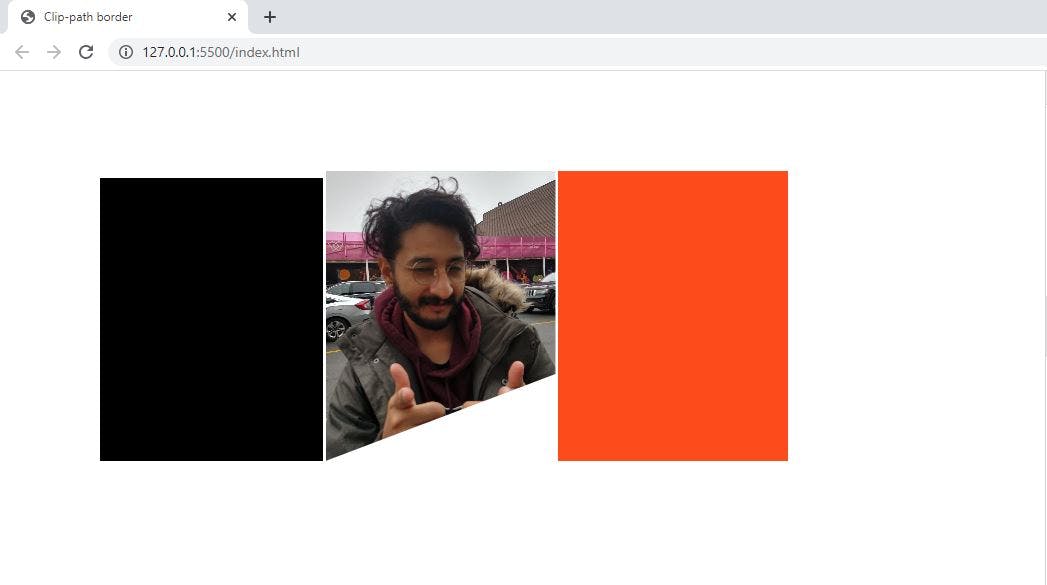
In order to add the decoration the ::after and ::before pseudo-elements of the figure are used, in this example, the ::before element will be used to "crop" the ::after element. Thereby the border element will have the same dimensions as the image and the cropping element will be slightly smaller.
.container::after {
    content: "";
    height: 29rem; /*290px*/
    width: 23rem; /*230px*/
    background-color: var(--color-decoration-2); /*Border Color*/


    /* TEST ONLY */
    display: inline-block;
}

.container::before {
    content: "";
    height: 28.4rem; /*6px smaller = 3px of border*/
    width: 22.4rem; /*6px smaller = 3px of border*/

    /* TEST ONLY */
    background-color: black;
    display: inline-block;
}
To move the pseudo-elements position: absolute is recommended. The ::before element is placed by default behind the image (a high z index is used to visualize the element), and the ::after element is placed right after the image.
.container::before{
    position: absolute;
    z-index: 11;
}

.container::after{
    position: absolute;
}
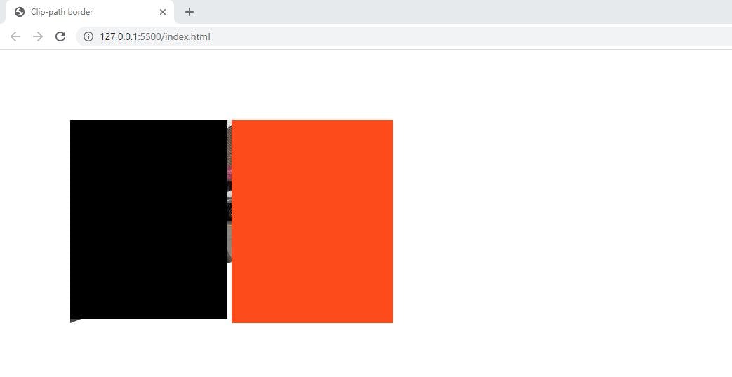
Lets now align the pseudo-elements using transform: translate
.container::after {
    transform: translateX(-100%); /*230px*/
    z-index: 10;
}

.container::before {
    transform: translate(3px, 3px);
    z-index: 11;
}
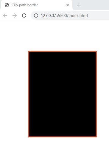
With the items aligned, the task of moving them became easier, so let's clip them and move them as follows
.container::after {
    clip-path: polygon(0 30%, 100% 0, 100% 100%, 0 100%);
    /*transform: translateX(-23rem)*/
    transform: translate(-20rem,-4rem); /*30px to the right and 40px to the top*/
    z-index: -10;
}

.container::before {
    clip-path: polygon(0 30%, 100% 0, 100% 100%, 0 100%);
    /*transform: translate(3px, 3px); */
    /*30px to the right and 40px to the top*/
    transform: translate(3.3rem, -3.7rem);
    z-index: -9;
    background-color: #FFF; /*Same as the background*/
}
The top of the border is slightly thinner than the rest of them, so after some trial and error the following adjustment fixed this issue:
.container::before {
    transform: translate(3.3rem, -3.6rem); /*1px lower*/
    height: 28.3rem; /*height is decreased in 1px*/
}
Before:

After:

Lastly, let's add a margin to the .container to include the decoration as part of the box.
.container {
    margin-top: 4rem; /*40px*/
    margin-right: 3rem; /*30px*/
    display: inline-block;
}
Before:
After:
 I hope you find this information useful and thanks for reading.
Always yours,
Carlitos xoxo 😘